For this assignment we were told to create a self portrait with our choice of oil or acrylic paints, but to add an interesting element to make it not like a normal self portrait. I chose to use a vibrant color scheme and to paint with acrylics. I faced two pretty big challenges while doing this project. First, I struggled with coming up with ideas and didn't really like the one's I came up with. That is why my ideas from brainstorming do not match my final idea. Second, which was my biggest challenge, was that I've never really painted before, so I had to learn how to as I went. For my first painting I think it looks good, but there are definitely things I could improve on. If I could change one thing, I would change the eyes. I don't really know why, but they look a little off to me. But that might just be that I stared at this painting for two weeks straight. My favorite part of the portrait is the shirt. I think I found a good balance between white and color. Overall, I really like how this turned out and will definitely do more paintings in the future.
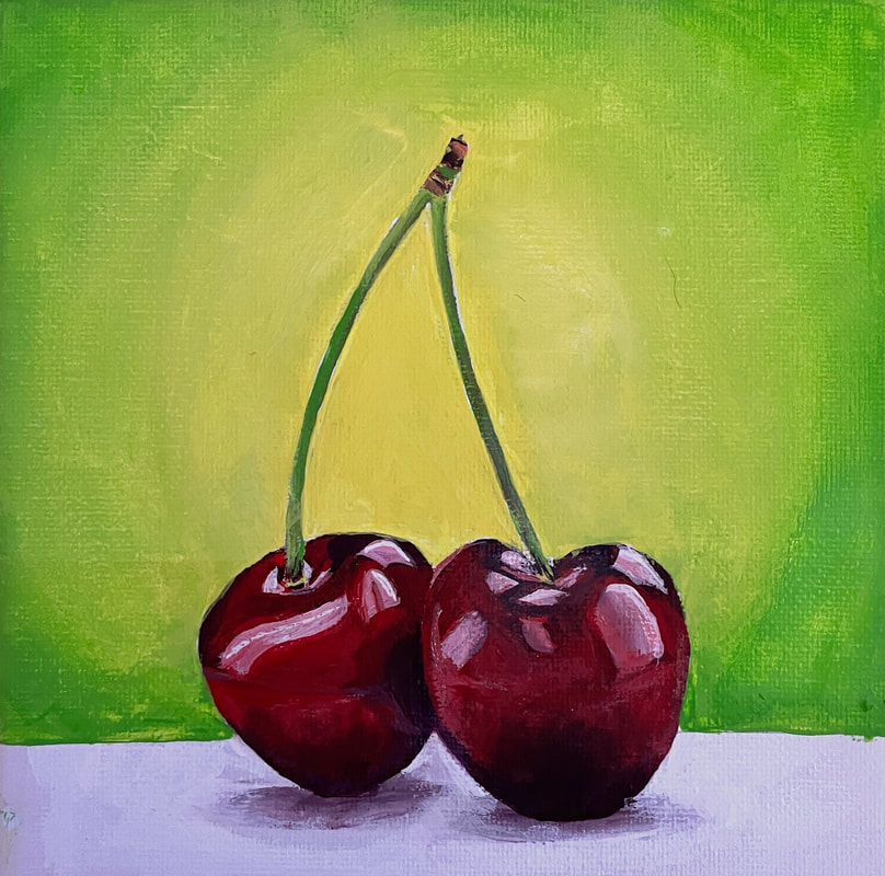
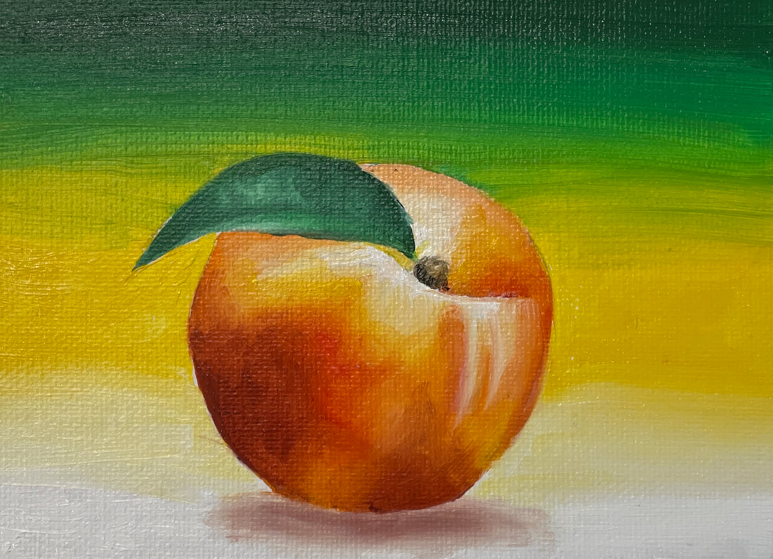
Fruit Paintings
|
|
To learn how to paint, we had to paint one fruit or veggie in acrylic and one in oil. My cherries are in acrylic and my peach is in oil.
Self Portrait artist research
|
For this assignment I chose to research Andy Warhol because I like his creation of his pop art self portrait. Although I'm not sure if that's the idea I will choose to depict in my self portrait, it is definitely one of my top ideas. I really like the use of color and the use of simple shapes coming together to create a full picture that is used in pop art. Many times it uses just a few colors, but still creates depth in the piece. Andy Warhol was one of the leading artists in the pop art movement. He also participated in many other art forms such as filmmaking, writing, and performing arts. He has done portraits of many public figures such as Marilyn Monroe, Mick Jagger, and Elizabeth Taylor. His self portrait is seen to the right.
|
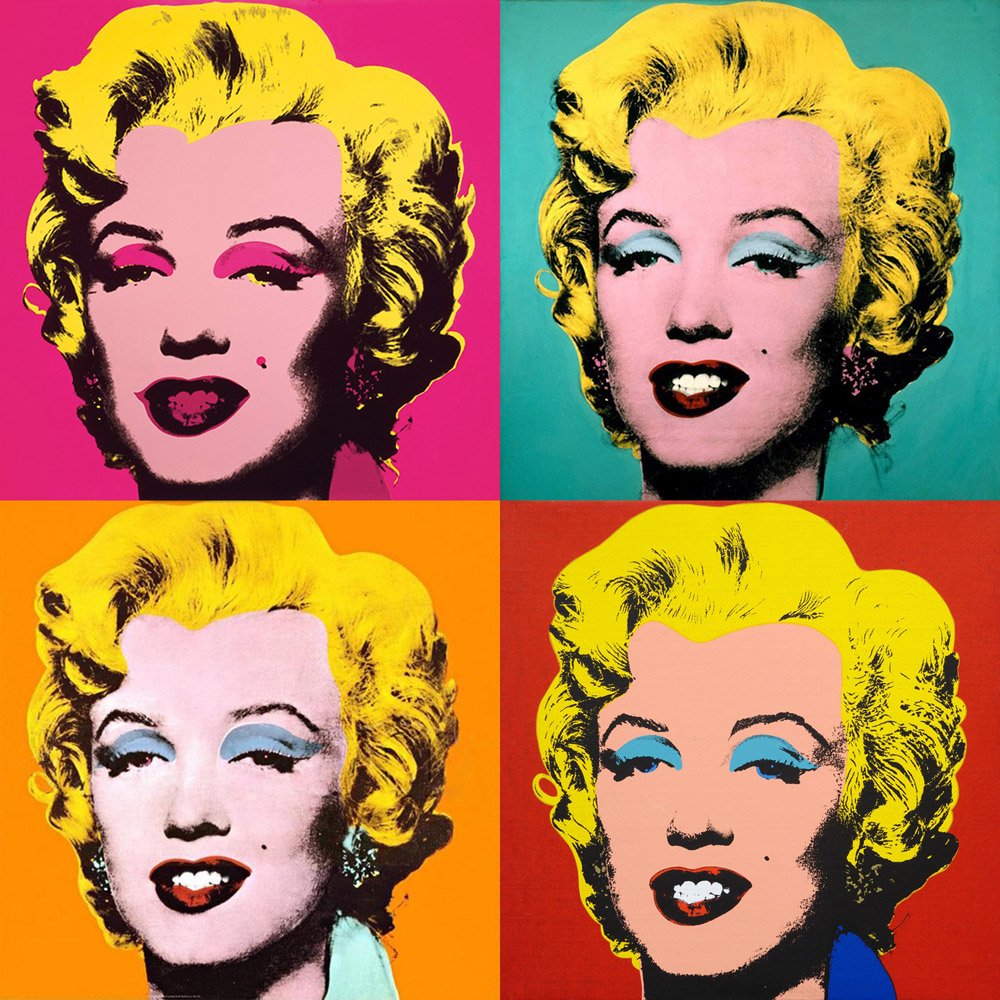
Marilyn Monroe
|
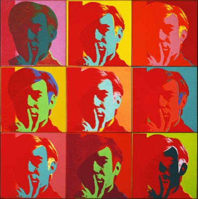
Self Portrait
|
Altered Book Project
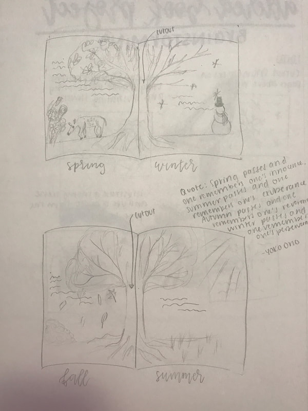
Brainstorming
|
In Progress #1
|
In Progress #2
|

In Progress #3
|

In Progress #4
|
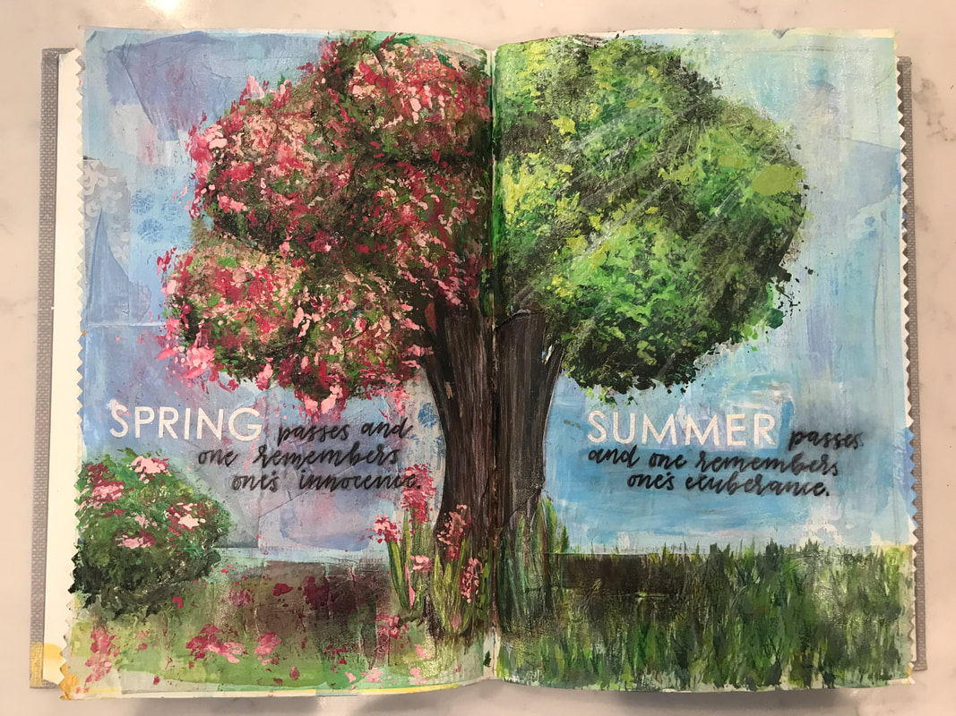
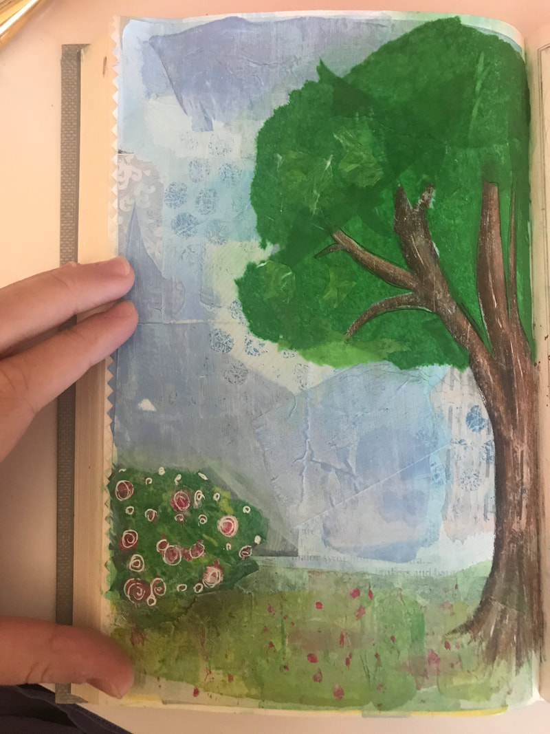
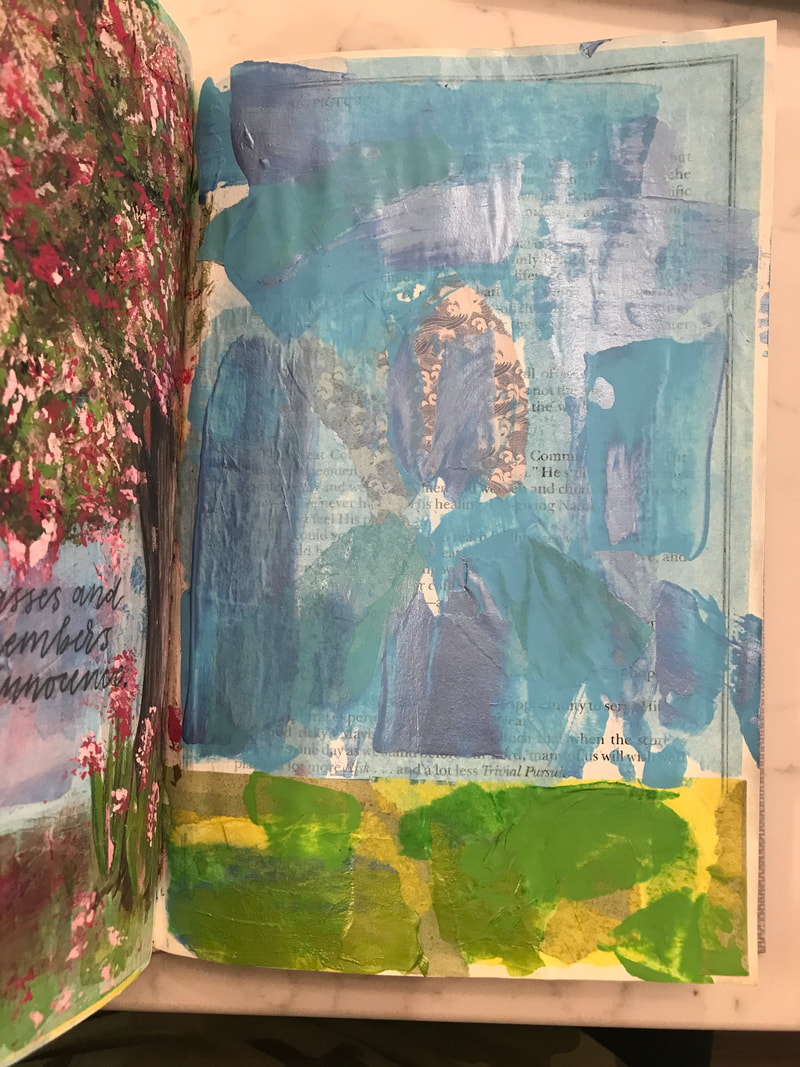
Final (Pages 1 & 2)
|
Final (Pages 3 & 4)
|
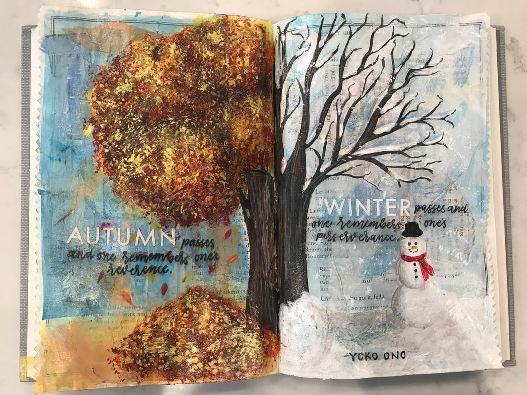
Honestly, when assigned, this project was not my favorite. But as I worked on it I began to enjoy it more and it ended up being one of my favorite things I've ever created. My favorite part of the piece is the flowers on the spring page and how they really add to the whole spring atmosphere. I also really like my use of texture throughout using tissue paper and other supplies, which can't really be seen in the photos. My biggest challenge in this project was the use of materials I'm not the best at. Drawing is my thing, but I cannot paint to save my life. To achieve the look I wanted, I had to paint part of this project though. So I had to teach myself some techniques, and overall I think it turned out good, especially for someone who is the worst at painting. If I could change one thing I would make the transition from fall to winter a little bit smoother, but I don't think it's the biggest deal or makes it necessarily look bad. Overall, I enjoyed this project more than I thought I would and the result ended better than I predicted.
Reflection Colored Pencil Project
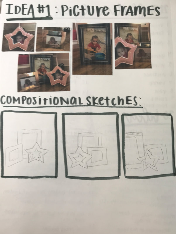
Reference Photos and Compositional Sketches for Idea #1
|
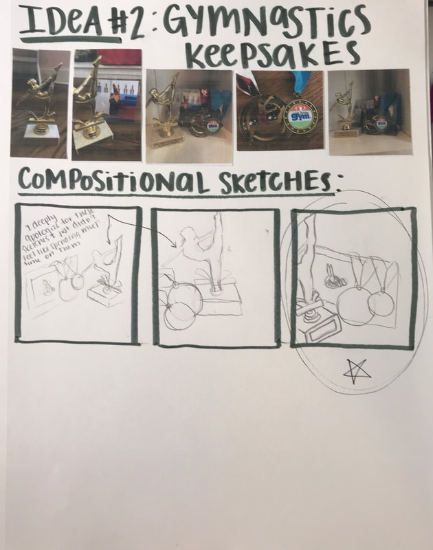
Reference Photos and Compositional Sketches for Idea #2
|
Final Practice Sketch
|
In Progress #1
|
In Progress #2
|
In Progress #3
|

Final
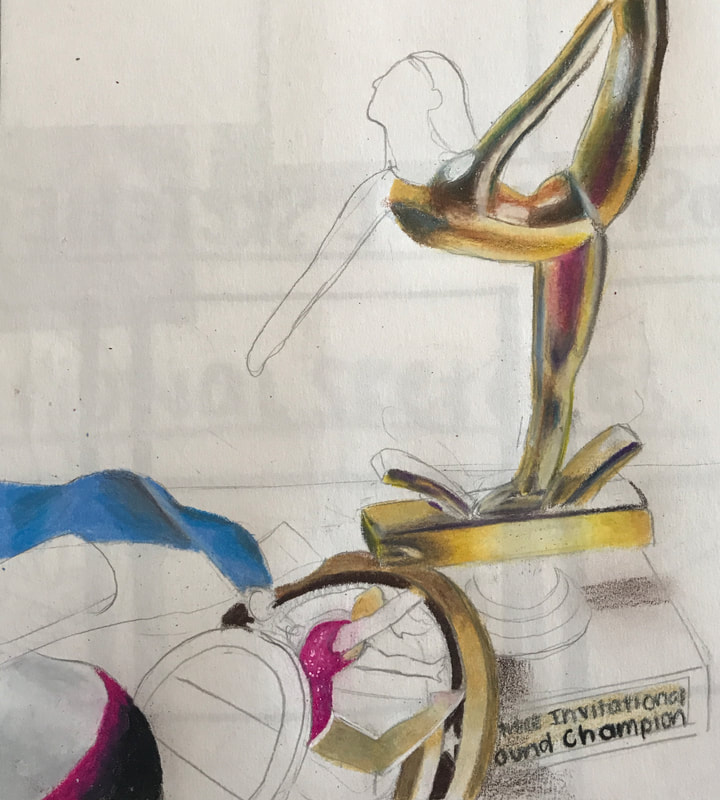
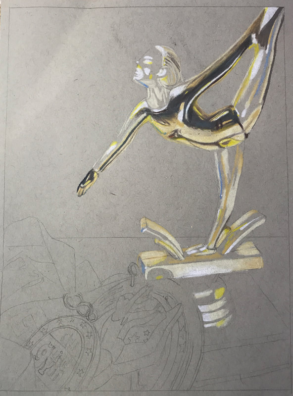
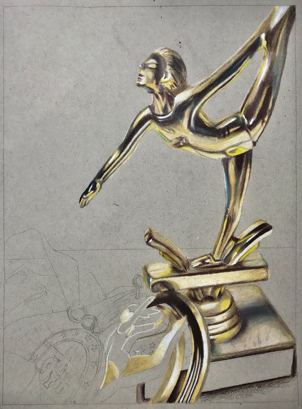
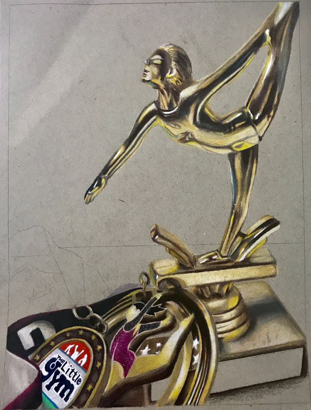
I came up with this idea while brainstorming what reflective objects were in my house. I have this trophy displayed on a bookshelf by my desk, and I saw it and thought that it was a nice reflective object that did a good job reflecting who I am, as gymnastics was a huge part of my life for such a long time. As I was doing this project, I found the trophy was hard, since I haven't ever drawn something with reflective golden properties like it before. In my sketch I definitely struggled with that, but I began to figure it out when I started my final. Overall I think the trophy ended up being my favorite part. When drawing, I started with the highlights for each part, then moved to the darkest shadows, then I filled in the values in between. I think this method worked out well because it made my highlights and shadows very dramatic. Colored pencil is definitely my best medium, but I think I grew in this project by drawing things that I hadn't done before and were a little out of my comfort zone. Overall I really like how this piece turned out, and it is definitely one of my favorites!
COlored Pencil Fruit
|
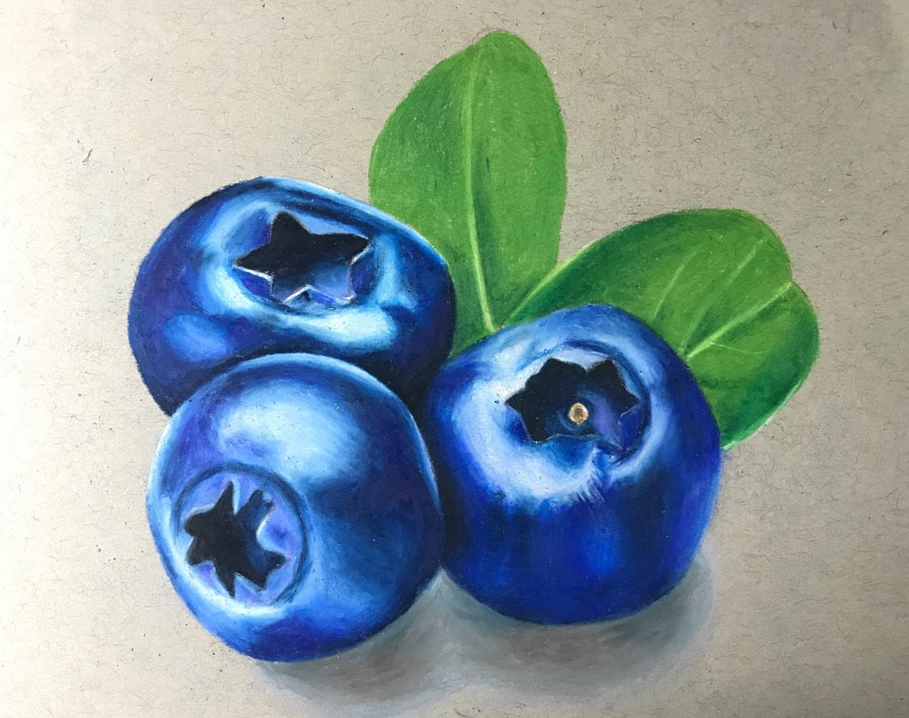
For this mini project we were instructed to draw a fruit or veggie with colored pencil. I just got back from the lake and there is zero fruit in my house so I had to draw from a photo. I really like the way it turned out and I think it is one of my better drawings.
|
|
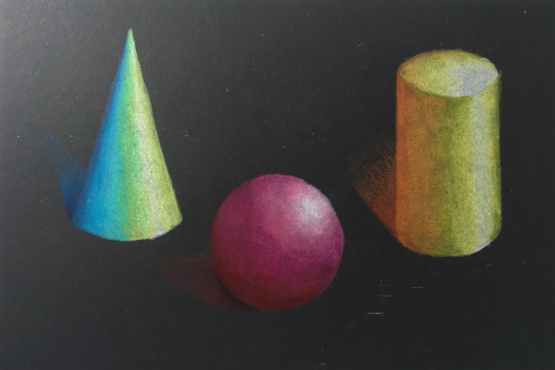
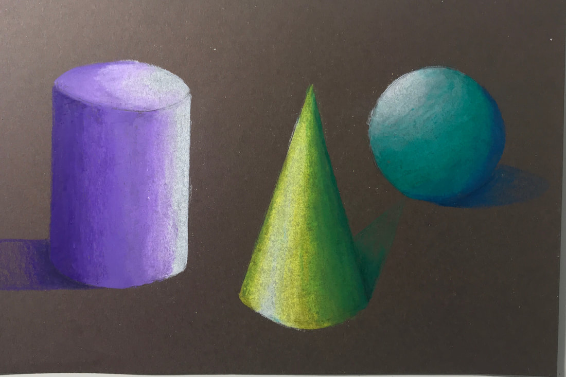
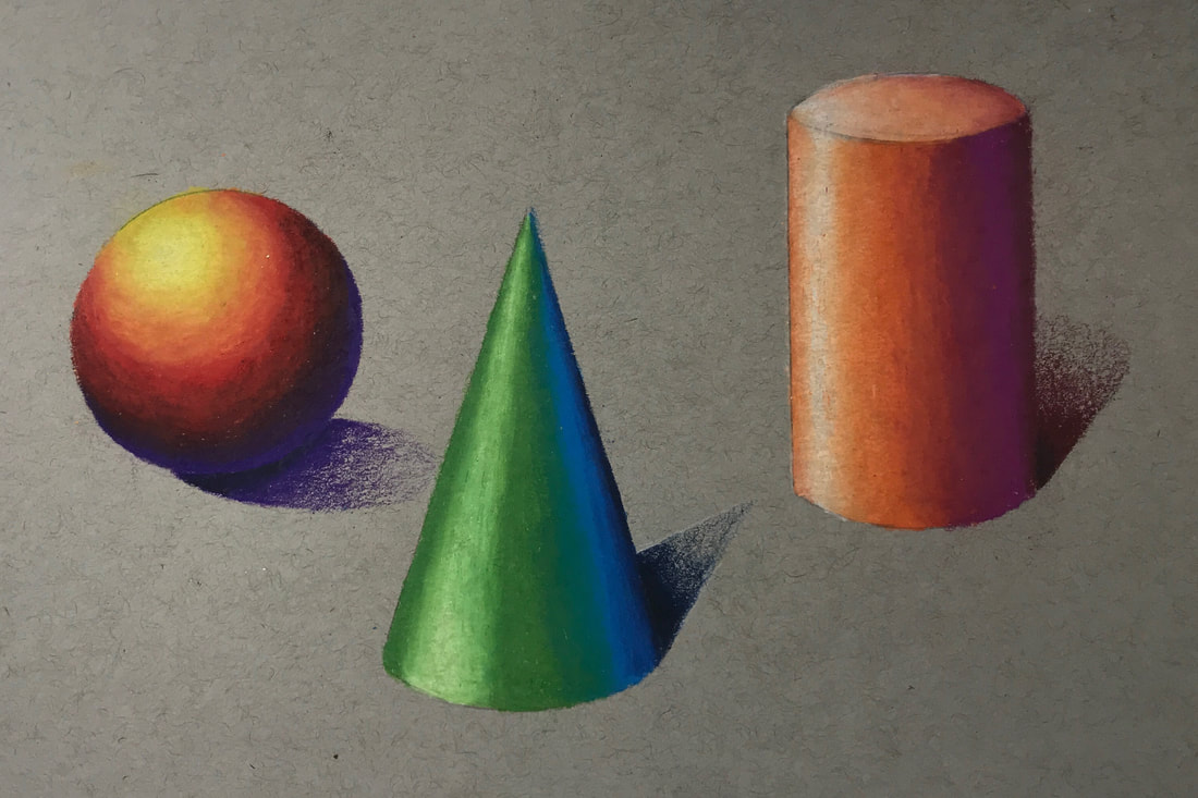
Colored Pencil Forms
|
|
|
These are my colored pencil form drawings. I used lots of different colors to draw a sphere, a cone and a cylinder. I used grey, black, and tan paper to see the difference on each. I think the ones on grey paper turned out the best and have the most vibrant colors.
|
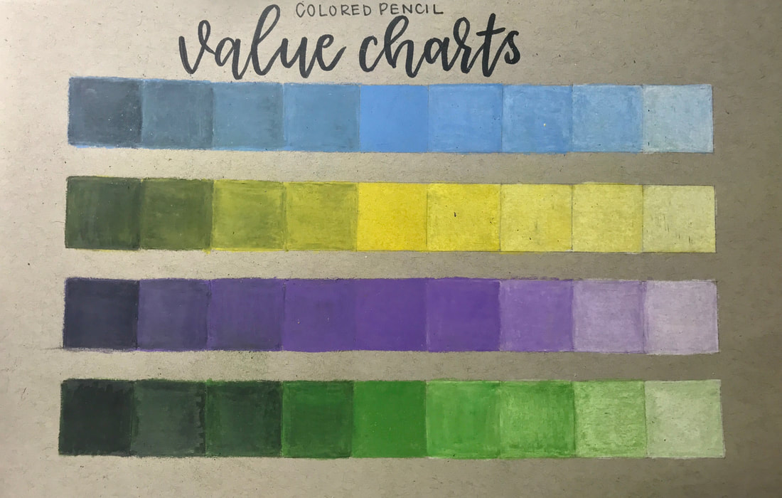
Colored Pencil Value Charts
|
These are my value charts that exhibit the tints and shades of four colors. I chose to use blue, yellow, purple, and green.
|
