Art from Found Object

10 objects
|
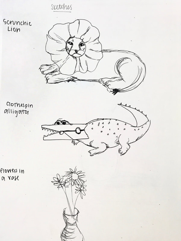
sketches
|

final drawing
|
For this project I decided to use dandelions after looking at all my objects. I drew a vase on a wooden table with a pen and then placed the dandelions on top to make them look like they're in the vase. Overall I really like how it turned out.
Getty Museum Art Challenge
|
For this project we had to recreate a painting with things around the house for the Getty Museum Art Challenge. I chose to recreate Paul Cézanne's painting, Still Life with Apples from 1893-1894. I think my recreation is pretty accurate with what I had in my house. I used a couple pottery pieces, a bottle of olive oil, some blankets, and obviously apples. It would have been better if I had a darker blue blanket and different colored pottery, since they aren't the same. Also, my apples were significantly larger than the apples in the painting, but I didn't have anything else. Overall, I think that this is pretty successful.
|

Original Painting
|

My Replica
|
A moment in Time Photography Project

This first photo represents the trouble people, including my family, have had with grocery stores. It's really hard to find certain items that people depended on before. This picture is specifically of the rice section, but there has been a similar issue with toilet paper, water, bread, beef, and something really big on my family, chicken. My mom has a lot of food allergies, and chicken was something that my entire family liked and could eat. Now, chicken is almost impossible to find, and when you do find it, there's a limit on how much you can buy. This has been really hard on my family to try to find food for everyone. Things, like chicken or rice, are things a lot of people depend on for meals, and now it's completely thrown off their lives.
|

This picture is of my driveway and the road I live on. I live on a pretty busy road right off of a highway that a ton of people use to commute, but as you can see, the road is empty. This photo really represents the emptiness of the world right now. Most people who don't have a job that is still operating don't have a reason to leave their houses, and when they do its just occasionally for groceries. I personally, rarely leave my house, which is so different than the life I lived before the pandemic. I used to drive to school, drive to work, and visit my friends all the time. Now, like most of the world, I've found myself stuck at home with nowhere to go. It's been a really hard adjustment to make and that's what this picture conveys to me when I look at it.
|
This is a picture of my front door. Like most people, I haven't been able to go through the door, since there's no reason for me to leave my house. I spend every day looking at the same four walls, windows, doors, furniture, and family members. I love my house and my family, but it's been two months, and I and many others are sick of this whole situation. I can't see anyone besides the four members of my family, I can't leave the same four walls of my house, and it's really been affecting me. I feel kind of trapped, and feel like this whole pandemic will never end. This is the mood of a lot of the world, and although this picture may just look like a door, it represents a lot more than that.
|
Warm Up
|
To practice for our photography project, we had to take pictures of something around us. I chose to take a picture of some flowers on my desk that my friend dropped off at my house for me. I also edited it to make the flower a little brighter and blur the background a little bit.
|

|
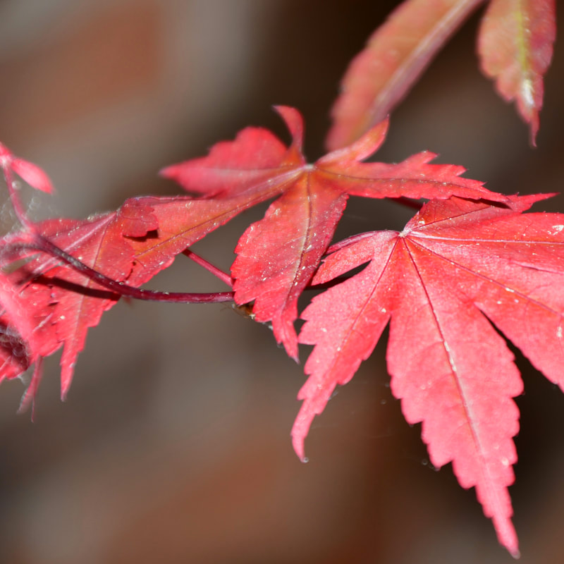
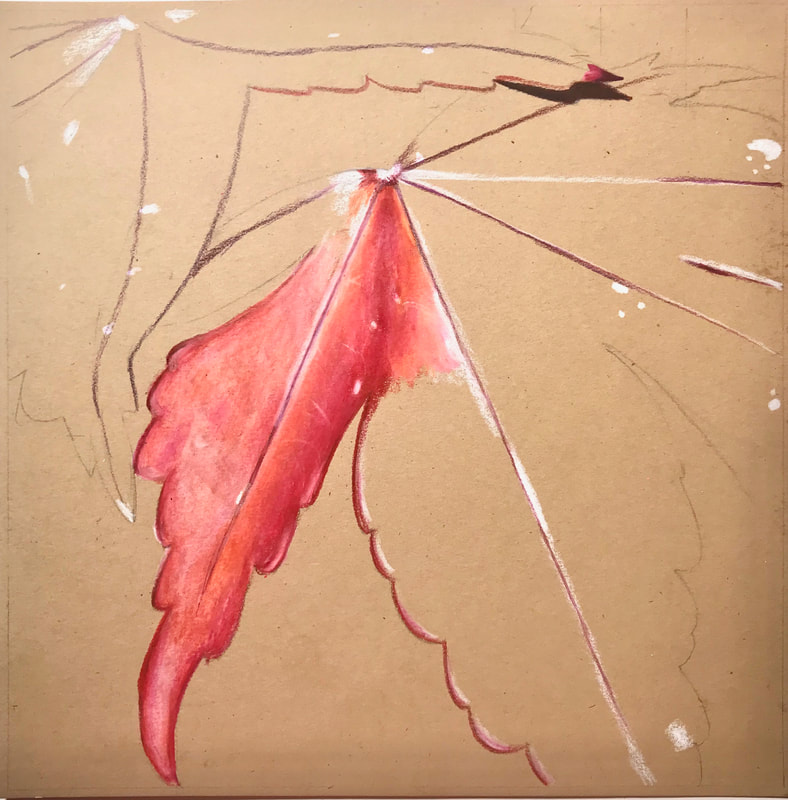
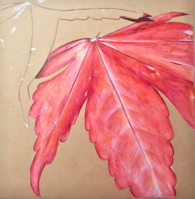
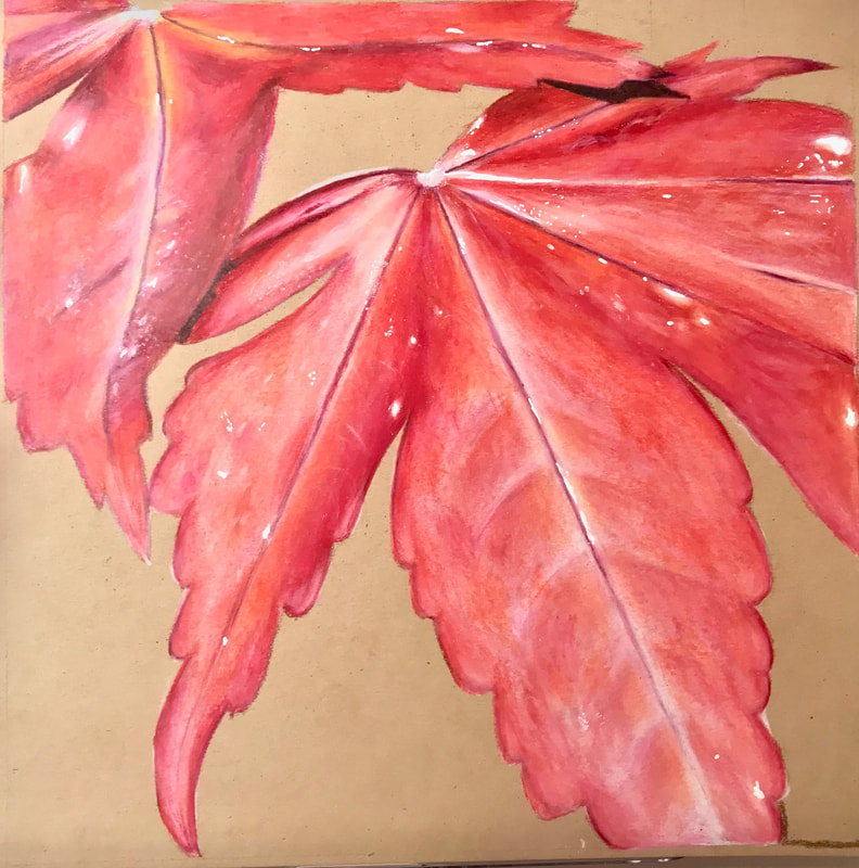
Georgia O'Keeffe Nature close-Up

15 Photo Choices
|

Compositional Sketches + Practice Sketch
|
Original Photo
|
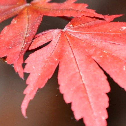
Photo Cropped to Composition
|
In Progress #1
|
In Progress #2
|
In Progress #3
|

Final Piece
Self Evaluation Questions
1. Describe the craftsmanship of your drawing. (Is it neat and well executed?)
I think I did pretty well with the craftsmanship of my drawing. It is neat and well executed, although I probably could've made it neater and made the colors blend a little bit better.
2. Do you think you used a full range of values to create the illusion of depth?
I think that I did an okay job using a full range of colors to create the illusion of depth. I used a lot of different pencils and closely examined my reference photo to see which colors I should be using.
3. How do you think you represented the style of the artist Georgia O’ Keeffe?I represented the style of Georgia O'Keeffe by taking these close up pictures to show the detail that can only be seen when close up, just like she did in many of her pieces of art.
4. Describe your choice of colors/color harmonies and how you used them throughout the artwork
While working on this piece, I used many different colors. The combination of pinks, reds, oranges, and purples in the leaf blend nicely to make it look realistic. I think that looking carefully and using a lot of colors really helped make my drawing look better.
5. How did you create contrast in your drawing?
I used contrast in this drawing by using bright colors in the leaves themselves, and using dull colors in the background. Because of that, the eye is drawn to the leaves, and allows you to focus on the big part of the drawing, while still having a realistic looking background.
6. How did you use textures, highlights and shadows to enhance your artwork?
I created the leaves textures by using purples to create the veins and various reds, pinks, and oranges to create the body of the leaf. I again, used purples for the shadows, and a white colored pencil to create the highlights where the sun hits the leaf.
7. Describe any difficulties you had creating your drawing and what you could do to improve your drawing?
I had some difficulty creating the texture in this piece. I ultimately fixed it okay, but it definitely could be improved. I also originally made the shadows too dark but was able to mostly fix that as well. Overall, I liked how this piece turned out.
Colored pencil Cupcake
|
To learn about using colored pencils, we drew cupcakes or ice cream on dark paper. The left is my reference photo and the right is my drawing.
|

Reference Photo
|

Drawing
|
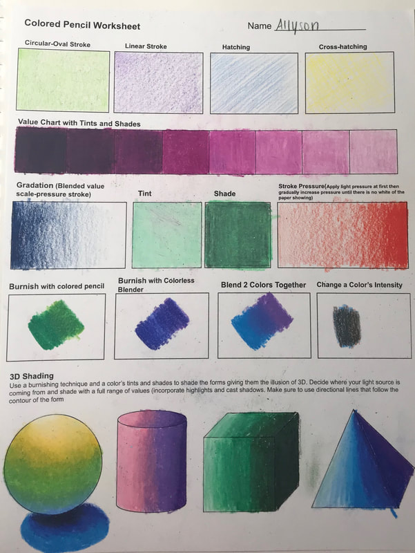
colored pencil Practice Worksheets
|
These worksheets I completed to practice my colored pencil techniques.
|
|
|
Fairytale Pen And Ink Drawing
|


Final Artwork
Evaluation Questions
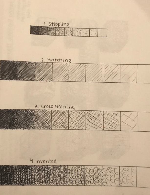
1. Discuss your decision on pen and ink techniques. Why you chose to use one or more.
- Stippling: I chose to stipple the stones lining each side of the river because stippling allowed me to create the smooth texture of the stones without any harsh transitions.
- Cross hatching: I used cross hatching on the tower because it was an easy way to emphasize the cylindrical shape of the tower by making my lines go in the same direction of the shape.
- Invented: I used an invented, squiggly shading technique on the trees to create the appearance of leaves from afar. By doing this it created a random effect that looked like leaves.
2. How did you use perspective? Why is perspective important?
I used perspective for the river and for the trees. The river decreased in size as it got closer to the horizen. Similarly, the trees that are closer to the viewer are bigger than the ones in the distance. Perspective is important because it helps an artist create realistic artwork that mimics how a person's eyes actually perceive things.
3. How is texture important in your composition?
Texture is important in my composition because it makes my artwork more realistic. My piece contained a lot of natural textures which made texture even more important. Some examples of textures in my piece are the stones, the tower, the grass, the trees, and the bushes. Each texture helps contribute to the overall piece.
4. Why is value so important in this project?
Value is important because, especially in nature, there aren't many abrupt transitions. By using value to show depth, it makes the artwork more realistic.
5. Describe your craftsmanship.
Overall, I think I crafted this piece really well. Each element is placed in a good place, and the structure of the artwork looks pretty realistic. I think the shading could have been a little bit improved though.
6. If you could recreate your piece what would you do differently to enhance your final outcome?
If I could recreate this piece I would give it a little bit more contrast. I think that each element like the tower, the trees, and the rocks are sort of hard to distinguish because I made them all pretty dark. Other than that, I really liked how this artwork turned out.
7. Which Fairytale or Fable did you create? How did you represent the story in your own way?
I recreated the fairytale Rapunzel. I included the tower, and Rapunzel letting down her hair, but I added emphasis on the surroundings and location. I added a river and more trees than is depicted in the illustrations of the actual story. This emphasizes her seclusion in the tower that is far from civilization.
8. When applying the pen and ink techniques why and how is it important to make sure you understand the concepts taught in class?
The concepts we learned in class are important because they will make our artwork more realistic. By creating value with the techniques we were taught, like stippling, hatching, and cross hatching, it creates dimension and makes the artwork much more similar to what you would see with the human eye.
9. As a growing artist how do you think what you have learned will guide and better your future projects?
I think doing this project has taught me that contrast is very important and can make a piece of artwork much more realistic. I will definitely focus more on that in the future. I also learned a lot about creating different textures, and will keep that in mind as I create other pieces.
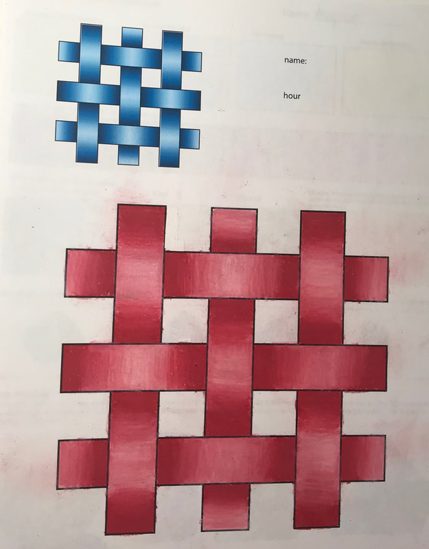
Pen and Ink Drawing
|
|

|

|
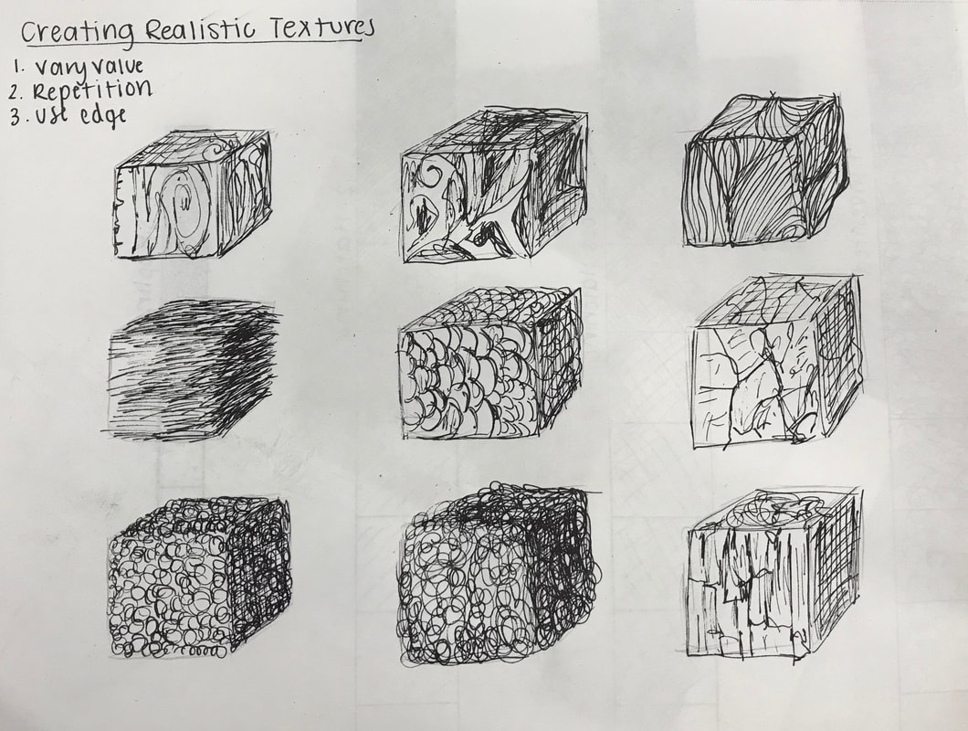
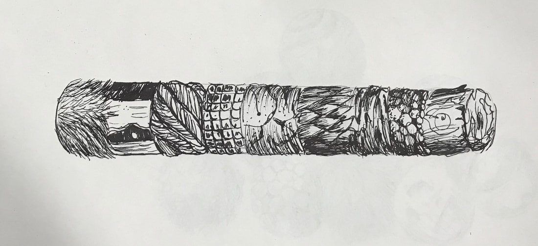
These are my practice drawings for learning pen and ink. The top left is a picture of my value charts for the different methods of shading with pen and ink and the rest of the pictures are the drawings I did from the tutorial videos.
Lego Perspective Drawing

|

|
To work on drawing with perspective, we used legos. This is my pencil drawing of the lego tower I built (reference photo on the left). The photo was in two point perspective, so I drew it with two vanishing points on the horizon.
Perspective Drawings

|

|


|

|
These are my drawings to practice perspective. The top two are one point perspective, the middle one is two point perspective, and the bottom two are three point perspective (left is worm's eye and right is bird's eye).
Value Drawings

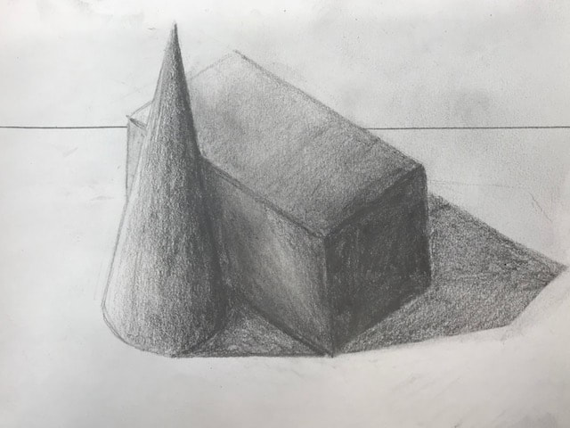
|

|
While practicing value we did many things. The top left image shows the value chart that I created and playing with the shading in different 3-D objects. In the bottom left I drew two 3-D objects next to each other focusing on their values. On the right I drew a still life drawing of this object (honestly I'm not sure what it is).
First Day Assessment Drawings

|
|


These are my four first day drawings. We were supposed to draw a shoe with laces, a portrait, a city in two point perspective, and a hand.
